Teen.Smokefree.gov
A responsive re-design for teen education
Smokefree Teen is part of the National Cancer Institute’s (NCI) Smokefree.gov initiative, to reduce the number of youth who smoke. At that time, this site did not work well on mobile devices which is what teens use the most. This is a short story about how I redesigned the site to be responsive.
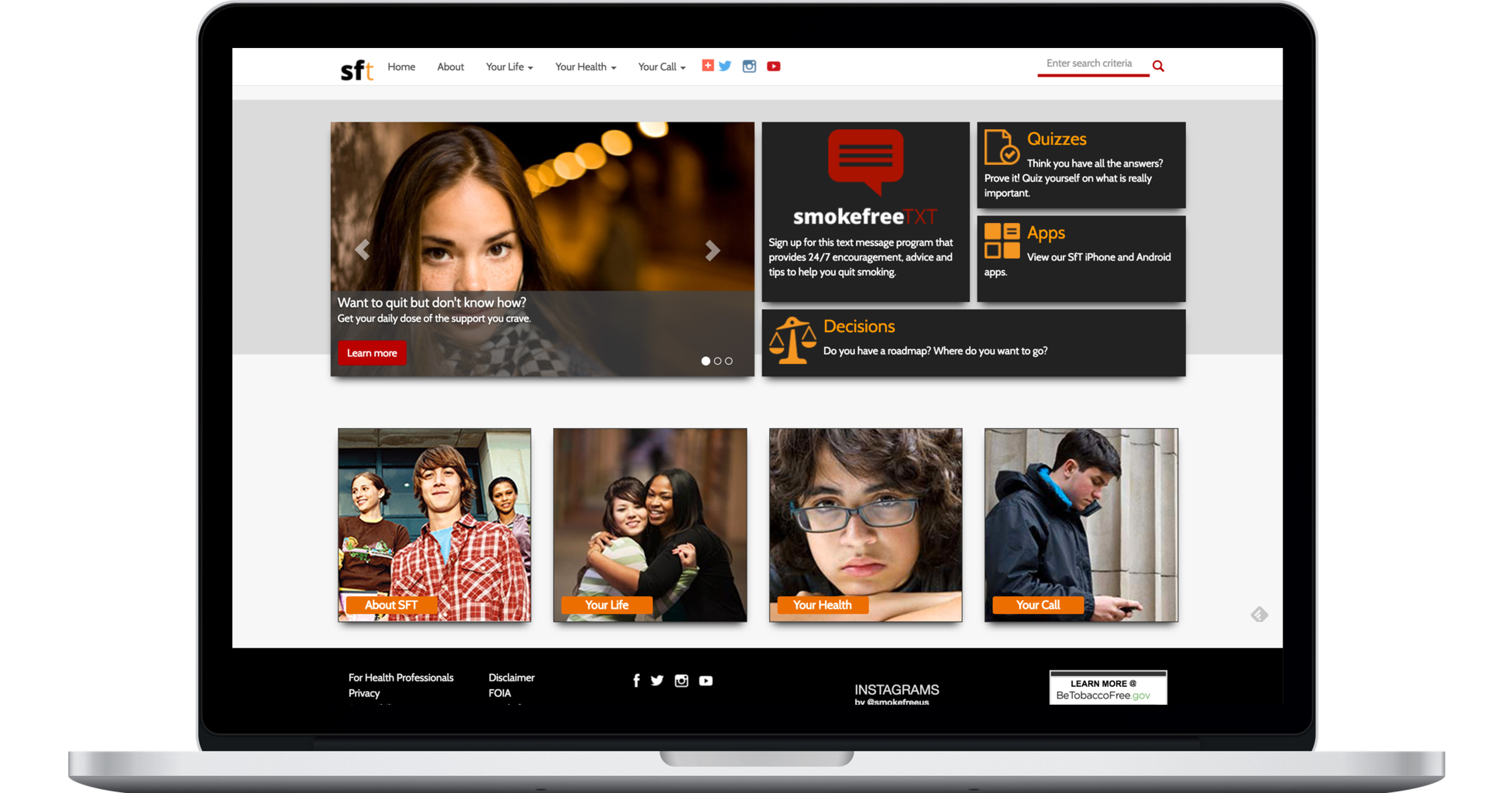
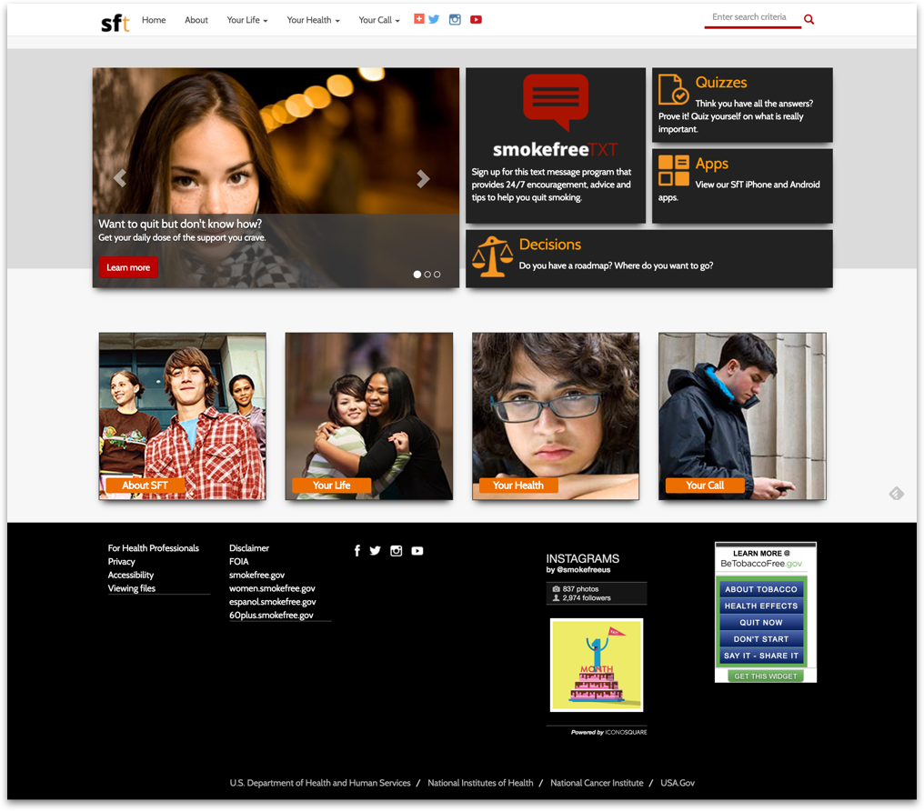
This is the responsive Smokefree Teen website
The task
- To make the site responsive.
- Keep the visual style.
My role
Ideation, design, prototyping, accessibility compliance, and testing.
The team
- Developer
- QA tester
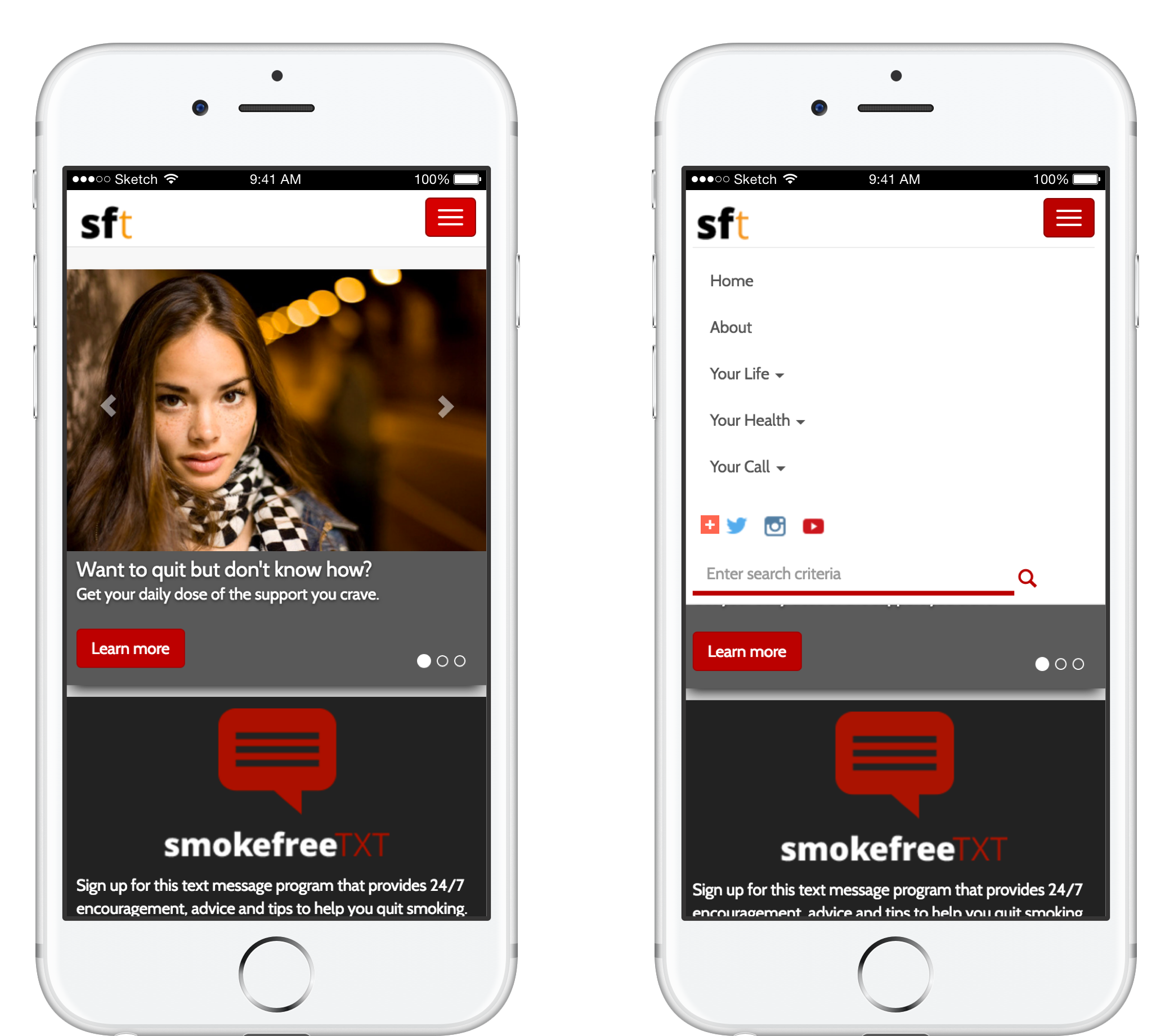
Mobile un-friendly
As you can see in the image below, the site worked well on desktop but not on mobile. A big part of this redesign was to look at how the new site will work on on IOS and Android devices, and at a variety of screen sizes. From updates to the navigation, to enabling touch on mobile screens.
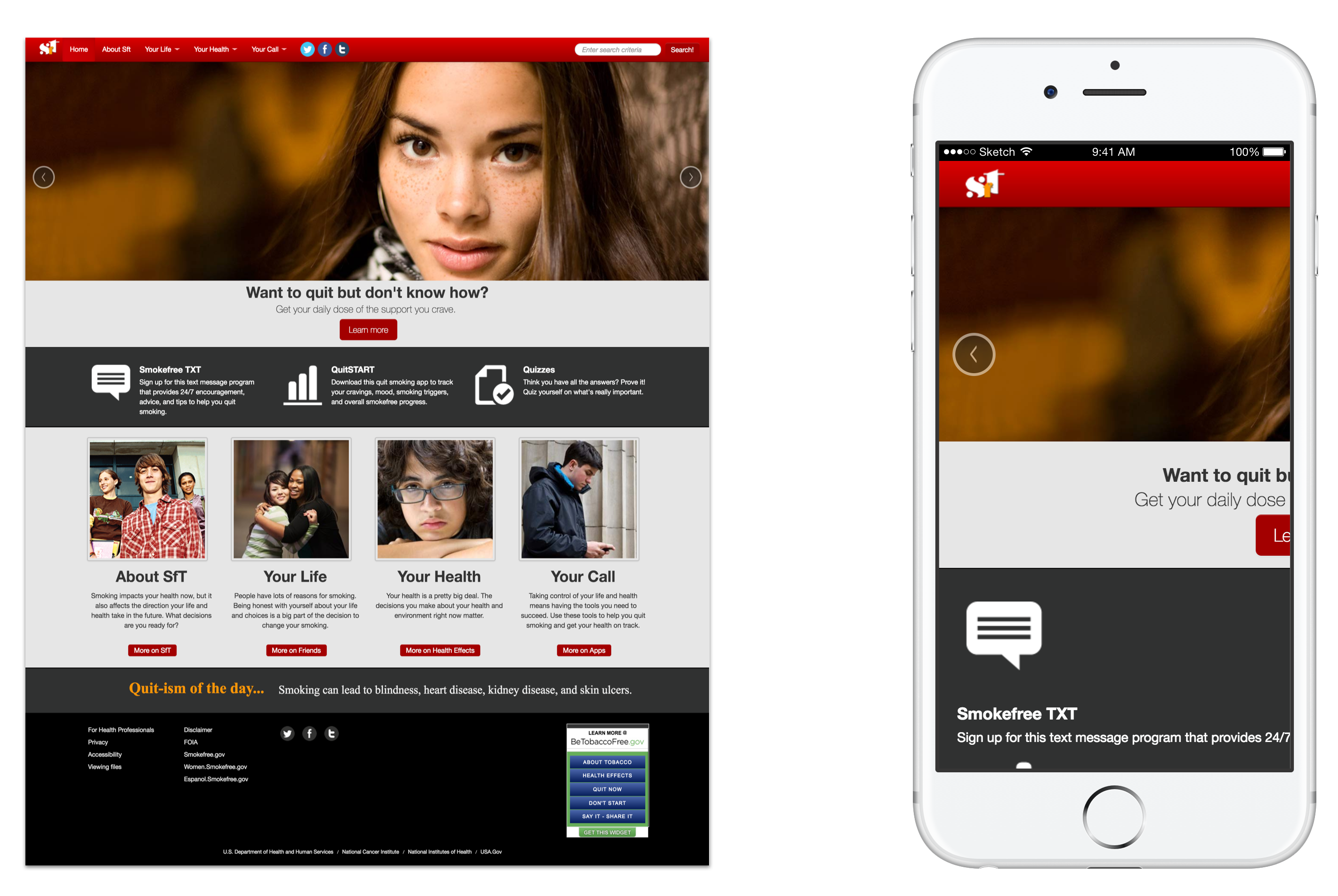
Desktop version worked fine (left) but not at all on mobile (right)
A refreshed look and feel
One of the constraints I had to work with, was to redesign the site while keeping the look and feel as close as possible to the style being used. These were the main changes as result of the redesign:
The Navigation Menu:
A clean new look, went from the bold red background to white, then after a few iterations, created a new logo, new social media icons, and a new predictive search field. Also, the new navigation menu was to respond to the changes on screen size (full size to icon), and hide on scroll down.
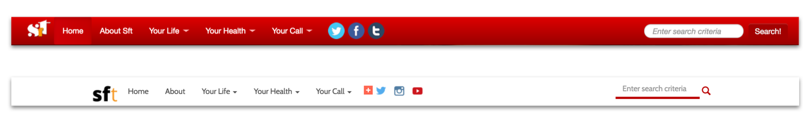
Here we can see the nav menu befor and after.
The Carousel:
It went from covering the full width of the site to a smaller version at about 60% screen width to allow for the Featured elements to be positioned at the same level while at desktop screen size. I have to say, I was not a fan of the carousel but it was decided that it will stay on the site for the time being.
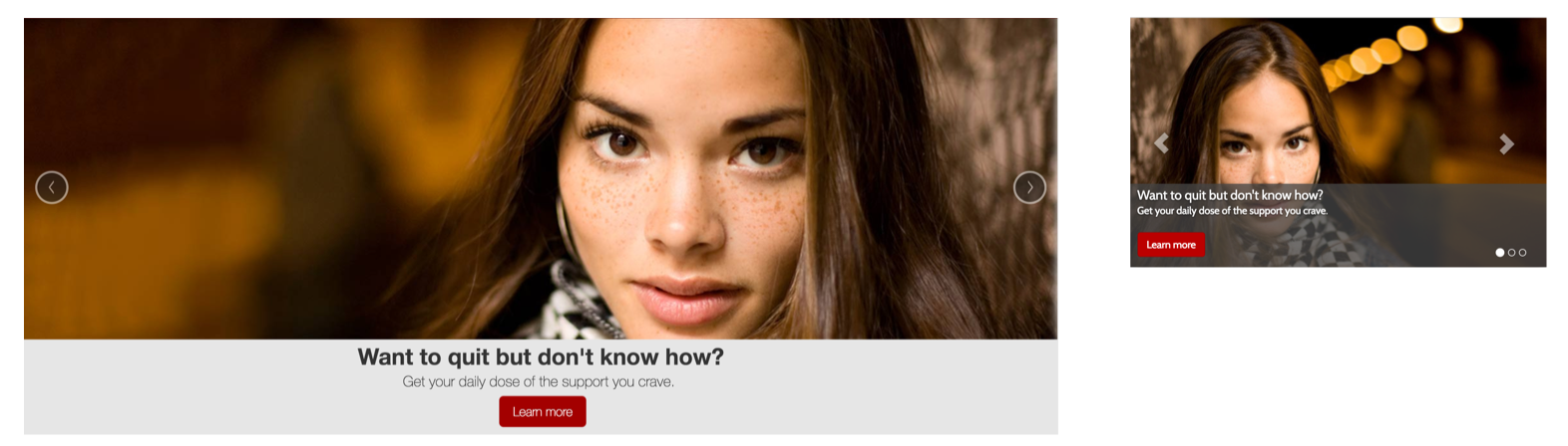
Old carousel (left), new carousel (right)
CTAs to sections
These are links to the main sections of the site. The idea here was to reduce verticality of the page, so instead of showing an image and description in a card, I changed them to be an image with a label that would reveal it's description, plus a link to take you to that section of the site.
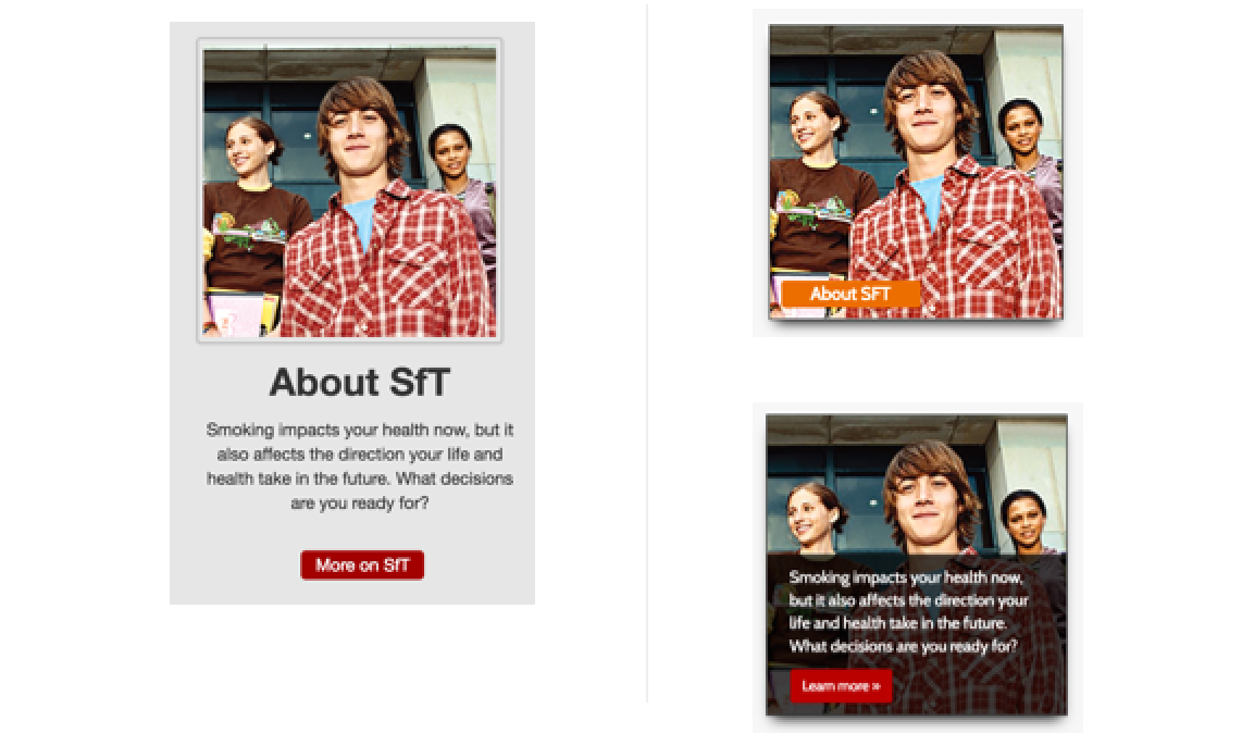
Old version (left), the new version was an image with label, with description on hover/touch (right)
Featured sections
These were links to sections like support by text message program, quizzes, and an iphone/android app. This new layout allowed us to add one more featured section than before.
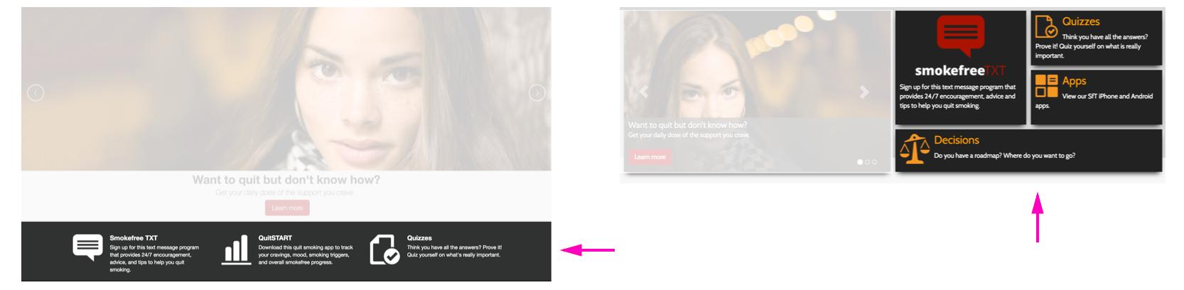
Featured links, before (left) and after (right)
The responsive re-design was coming together
The newly redesigned version of the site was more modular, making it easy for components to self adjust to different screen sizes and resolutions.
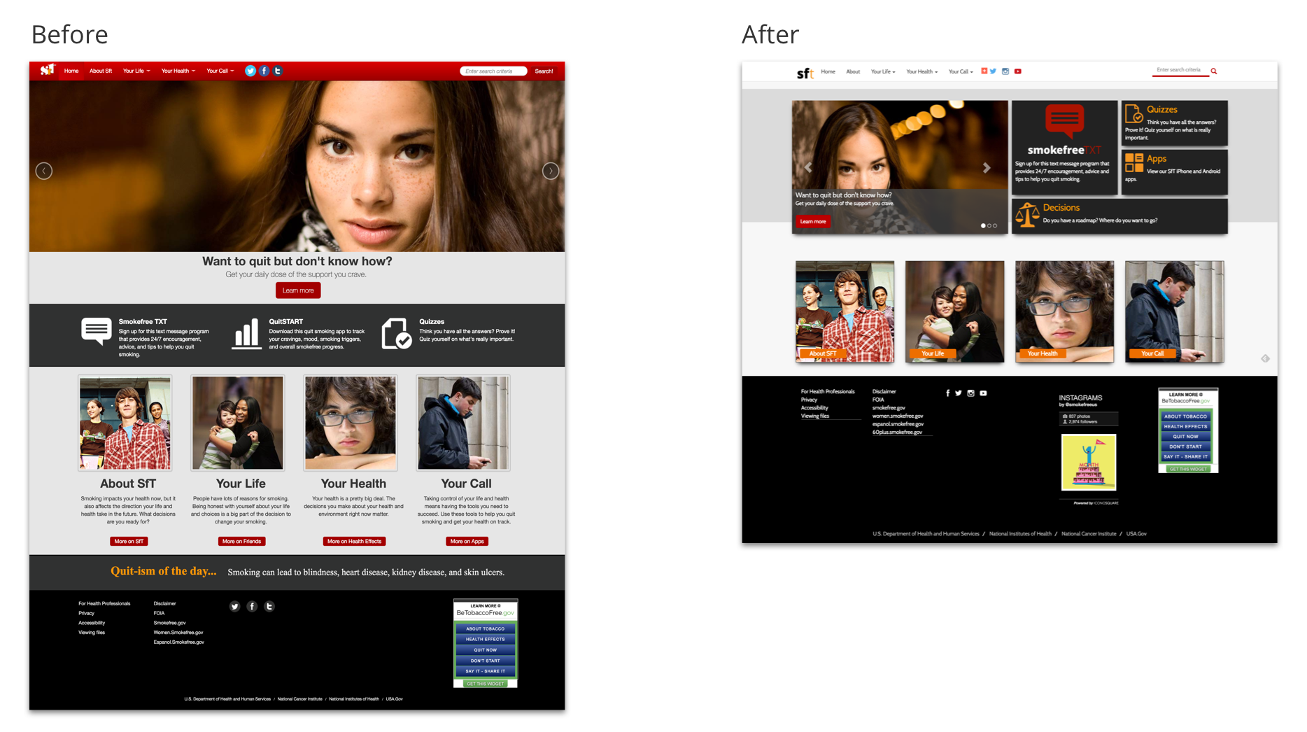
This is a before (left), and after (right) comparison