Healthcare.gov
Designing a better and responsive way to navigate a massive site
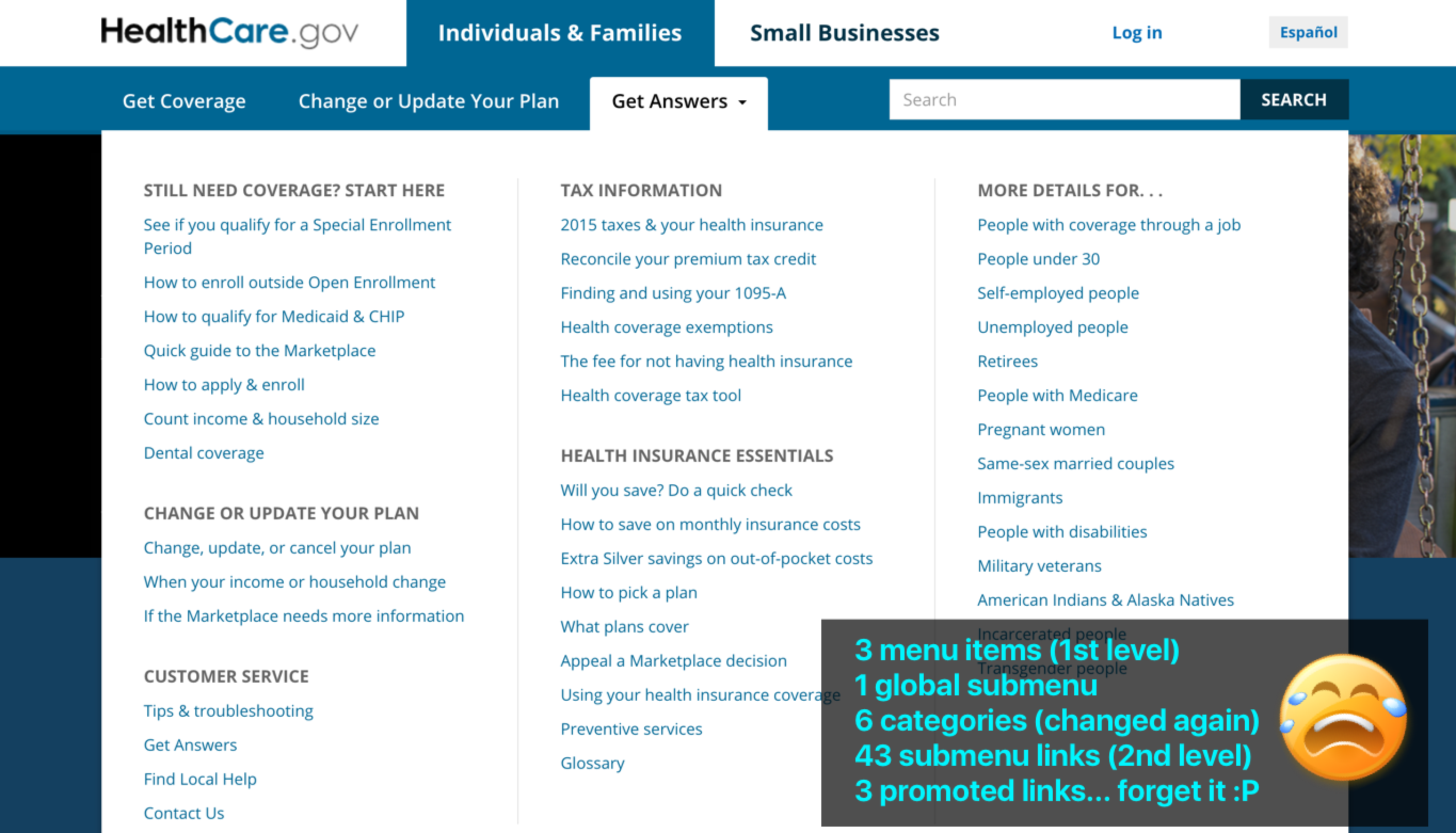
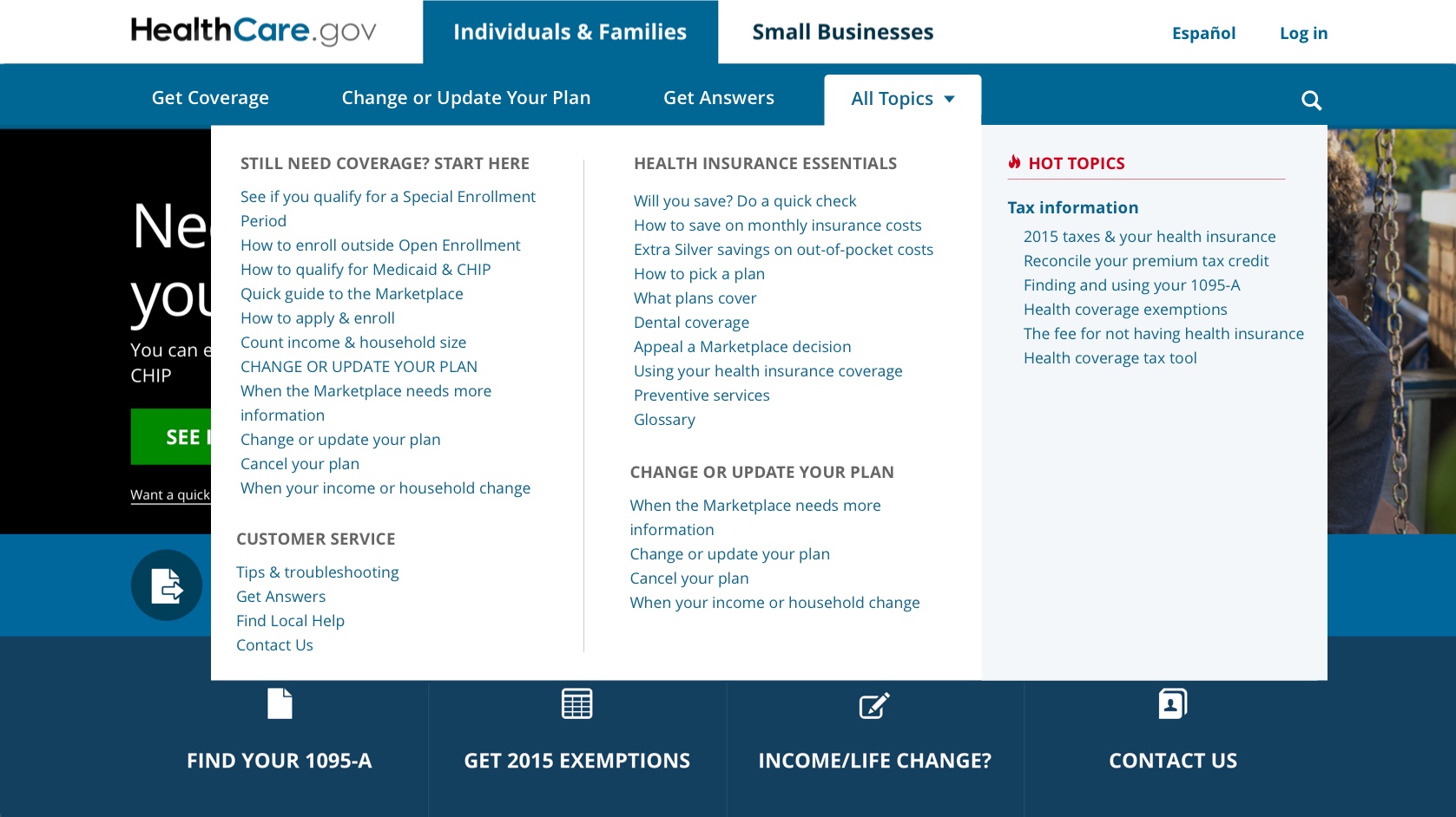
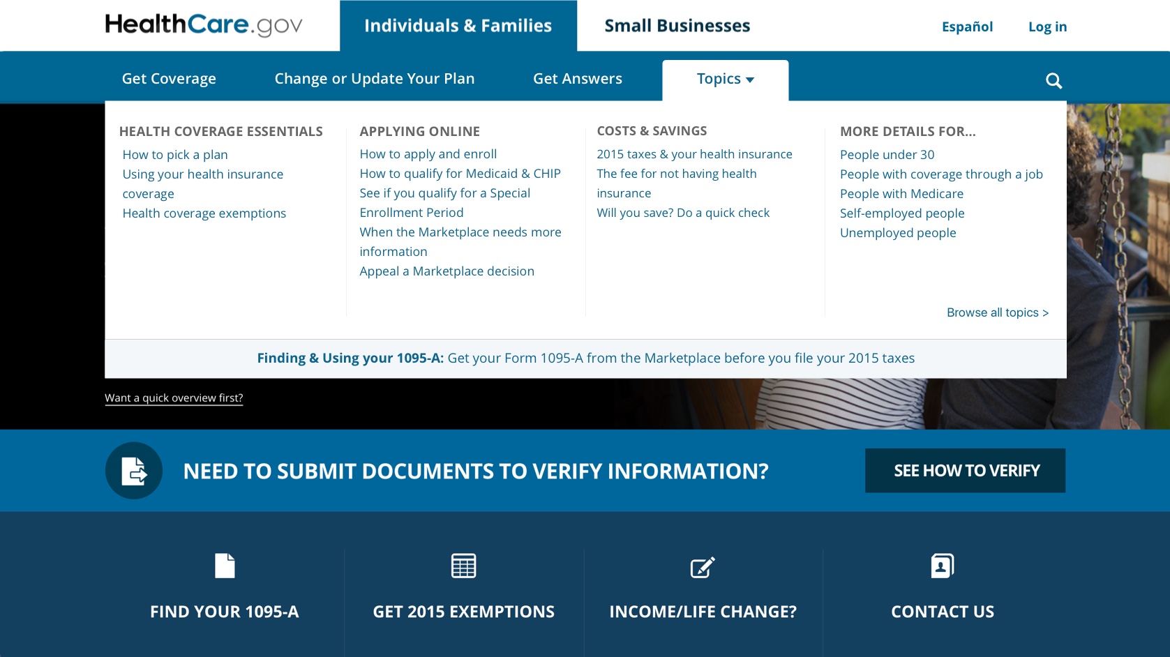
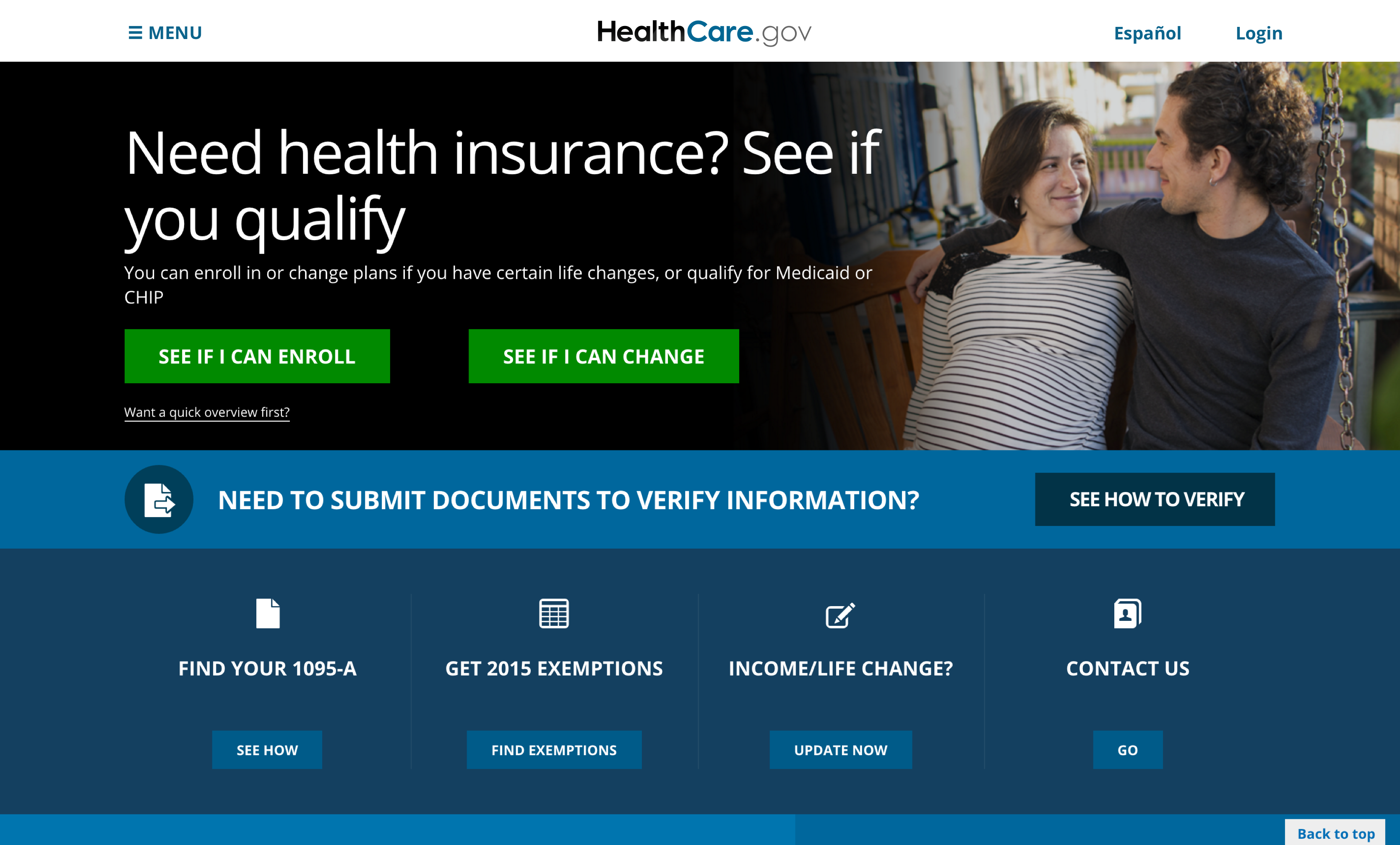
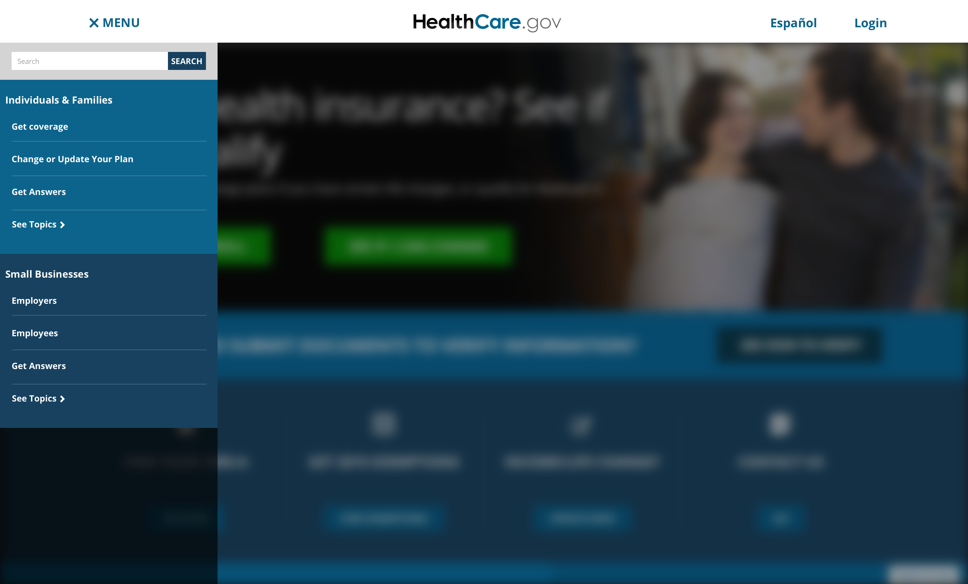
This was an opportunity to make it easier for millions of people to find the best healthcare information and options available to them. The over bloated desktop "mega-menu" was confusing and also didn't work on mobile devices. The image below shows how the menu was so bloated that it covered the entire screen.
The Opportunity
- Improve the mobile User Experience.
- Design a consistent multilevel menu functionality.
- Meet accessibility requirements.
My Role
Discovery, ideation, design and prototyping.
The Team
- 1 Designer.
- 1 Information Architect.
- 1 Developer.
Our users felt overwhelmed at first
User feedback consistently made it clear that the menu had too many links to go through while trying to find an option that matched what they were looking for.
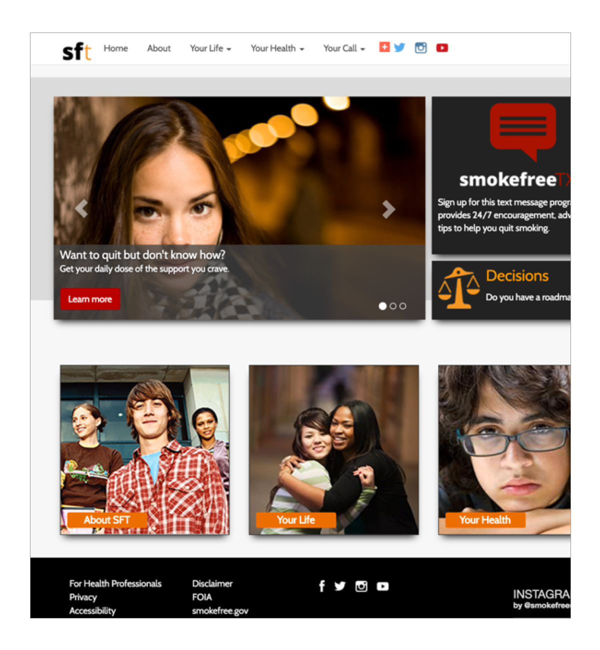
I pictured them reacting to the menu like the guy on this image did.

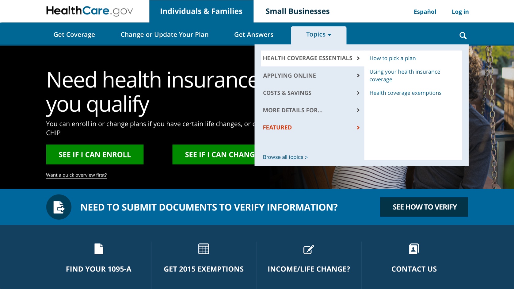
Taking a closer look into the mega-menu
During the discovery phase, it was important to understand what our users were looking to find in our site, this in connection with seasonal campaigns, and also the site's Information Architecture.
I was also trying to understand what would be the user's expectations in relation to the menu and it's functionality. Was there a better way in their minds?... or the familiarity of using the menu was more important to them?
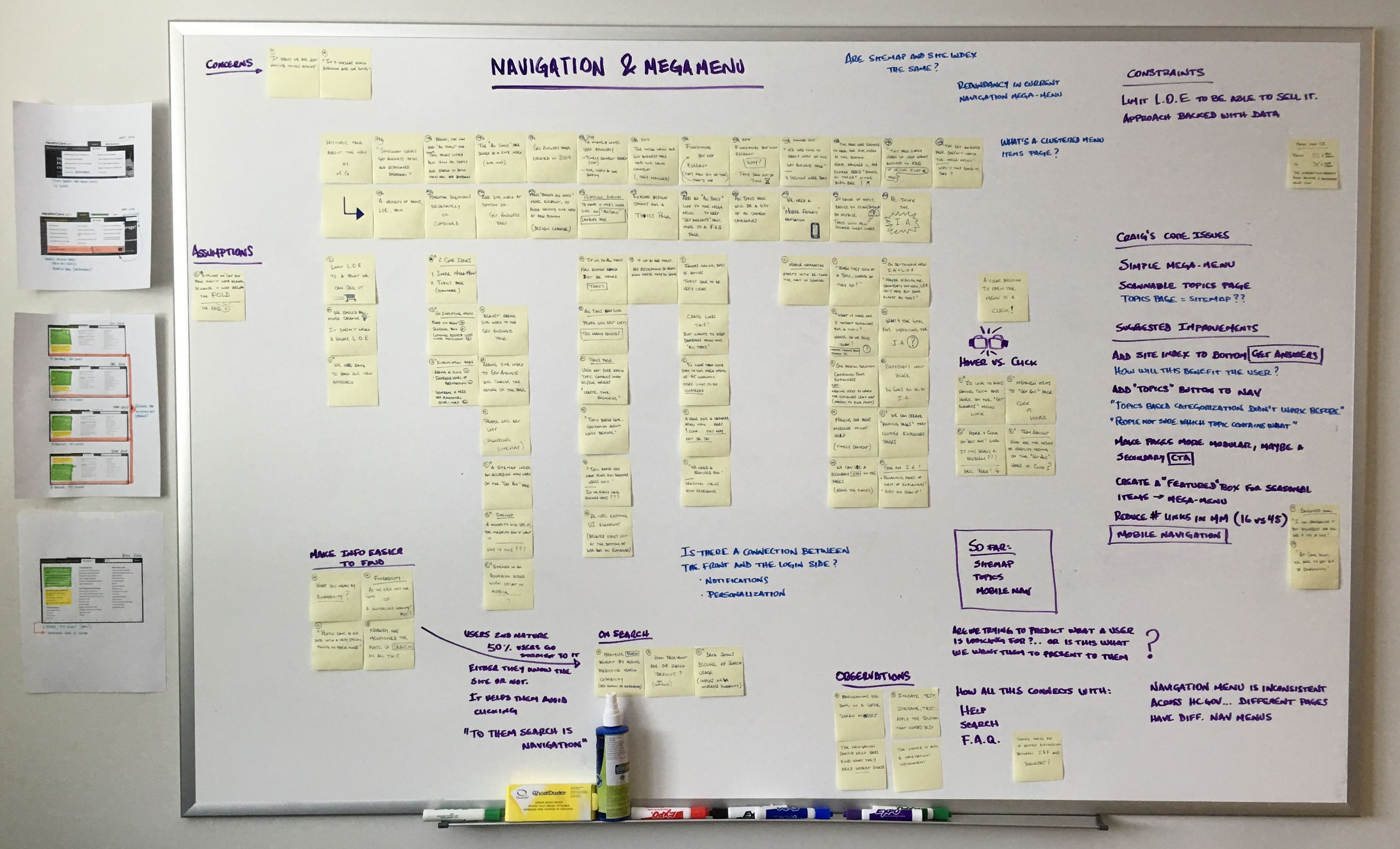
Making sense of the Information Architecture
I was also hoping to find clues that could explain what was the reasoning behind all of the menu changes through time.
Here is what I've discovered:
- A significant percentage of users preferred to use search instead.
- Many users were familiar with the menu but the constant updates confused them.
- Users had also expressed how difficult was to understand the content at times.
- Menu links were being added and removed based on a seasonal criteria.
- Menu links were being added and removed for political reasons.
- The menu items were assumed (by different groups in the organization) to be what people needed."
- The search functionality was totally neglected.
By doing this research I learned how to better provide help for our users, the role of search functionality, how the site was structured, even our content readability levels, and more.
The menu needed to be restructured and slimmed down.
We reduced the number of links to 24 in the menu, and defined guidelines for links curation, then I had to focus on layout alternatives. Below are the options that were considered.
3 columns, 1 hot topic section
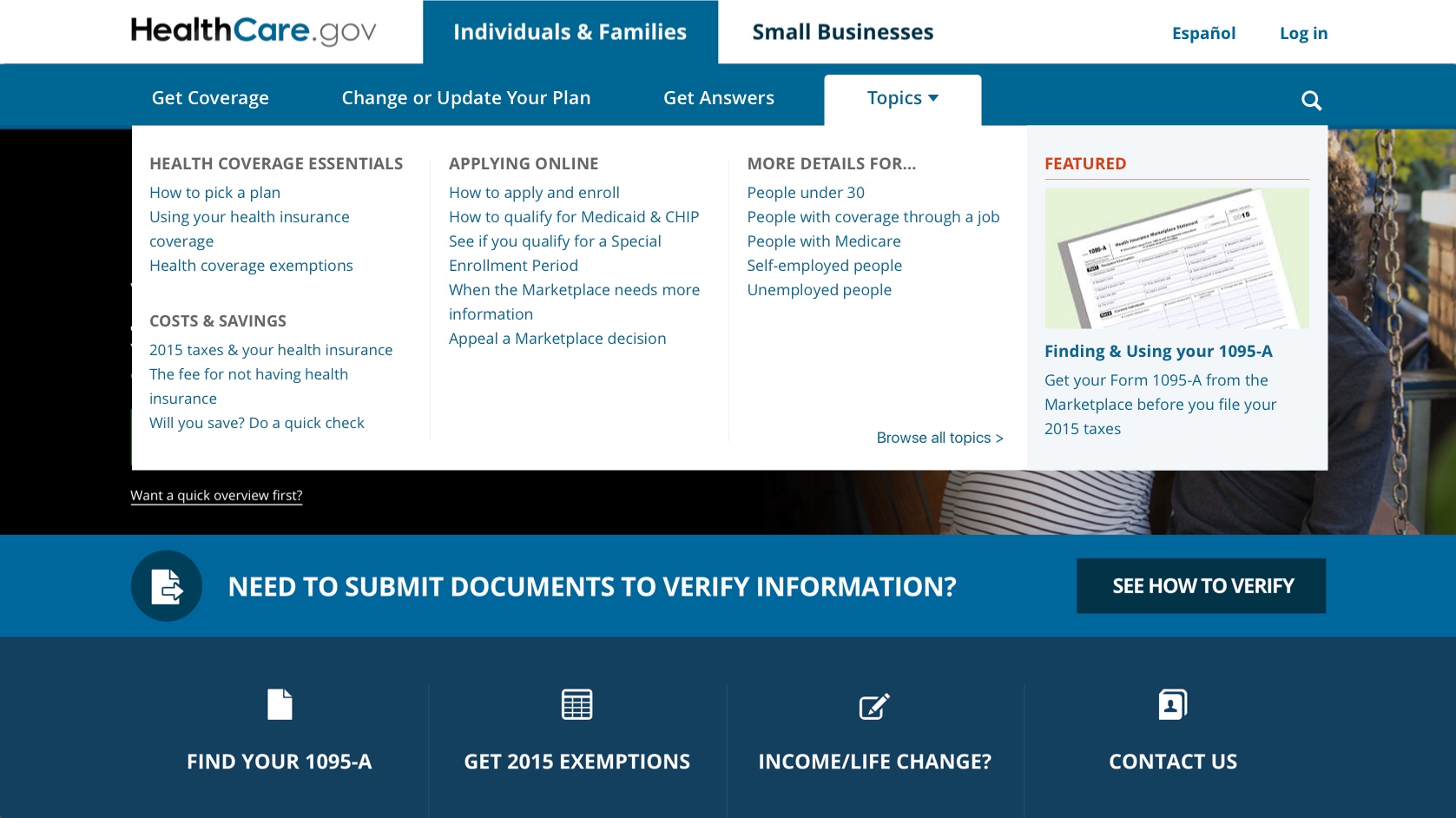
4 columns, 1 featured area with image (right)
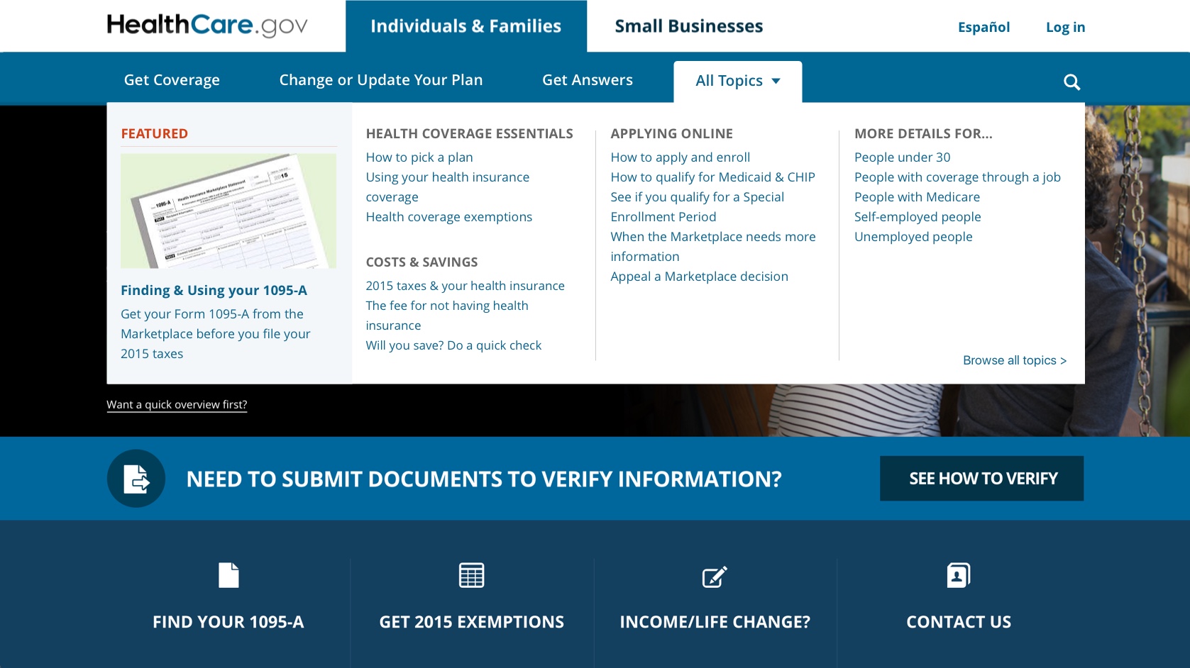
4 columns, with left aligned featured area
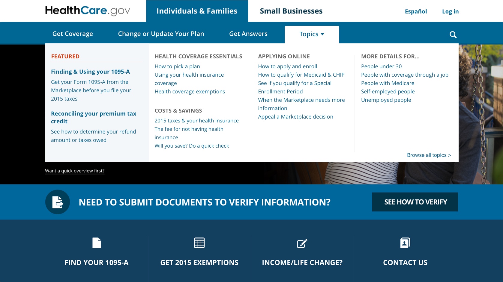
4 columns, with left aligned featured area (no image)
4 columns, featured area bottom
2 columns, tabbed categories including featured section
The choice wasn't easy because the requirement was to keep the menu close to the way it looked and worked before. My favorite option was #6 because it would've been a seamless experience on mobile but in the end got turned down.
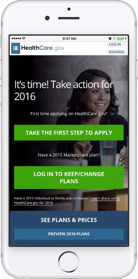
Ok, that was for the desktop version but I needed to make it work on mobile
To do this, I had to graciously translate the mega menu into
something that works on mobile, providing the same functionality
as the desktop version in order to try to keep the experience
consistent.
On the right, you can see how the menu worked on mobile, it was clunky and worked differently than the desktop version. And yes, the transistions were awful.
Designing a new menu concept
My goal was to create a menu that had similar functionality as the desktop version, trying to keep the experience intact. It took coordination between design, development, QA and the product owner to make sure this was what everyone had hoped for.
And here are the user flows
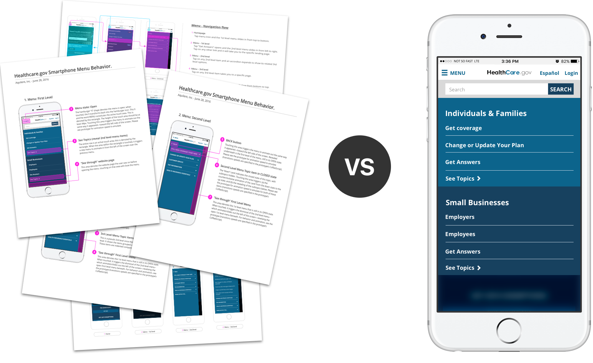
Below you can see a flow diagram that I created to help my team and stakeholders to understand how users could navigate through the 3 menu levels while using their phones.
I made a prototype to share with devs and stakeholders
The new mobile menu was complex, it had many interactions that were almost impossible to communicate using just flat documents.
That's why I decided to create a prototype, to be able to demonstrate the concept to stakeholders and also to do initial testing.
On the right, is an example of the prototype I shared with the
team. Click on the menu to see it in action, then you can try this sequence: menu > see topics > 1st list item.
Click on x-menu to close it at any time.
Our stakeholders were blown away
The interactive prototype was perfect to show the final result, showing the menu in action. Otherwise it would've been very hard to communicate it's functionality by use of flat documents. For example, the speed at which the menu will slide in/out the screen.

Cool! but hmmm... wait a second
In case you are wondering why the desktop and the mobile menu don't really
match in functionality and overall experience?
A fair question indeed but the circumstances surrounding this website at the time, made it impossible to implement the update consistently.

Dealing with reality
Even though everyone involved was onboard with the new version of the menu, our stakeholders feared that it was a drastic change from the previous (and less efficient) version. That was an assumption that I wish I had a chance to test with users but we had no time nor budget for that.
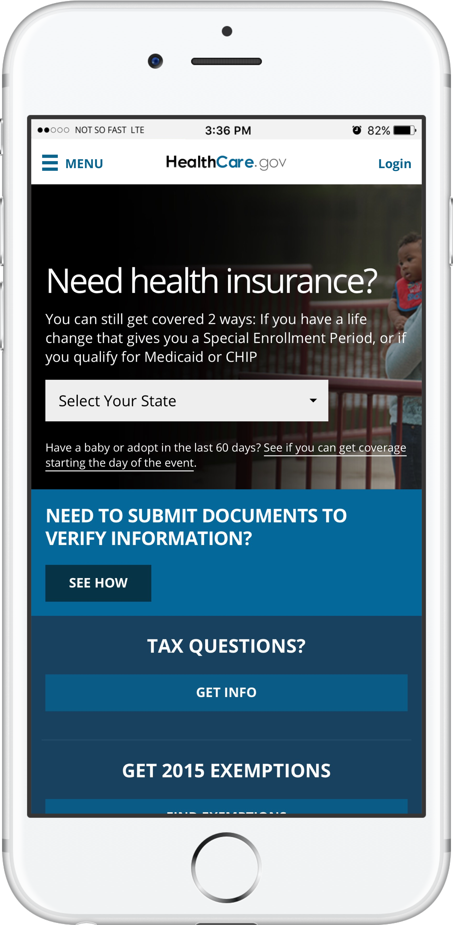
The images below show how the mobile menu could've been used on desktop, making it consistent with the mobile experience.
Desktop navigation menu : Closed state
Desktop navigation menu : Open state
So, it was decided that the new menu version was to be introduced on mobile first, and then maybe update the desktop version at a later time. I personally didn't agree with this decision but that shows the sometimes there are decisions made that escape our control as designers. A good lesson learned there.
The prototype was way better than sharing mockups
The prototype did a great job in communicating the concept & functionality to the stakeholders and that speeded up the approval process.
If you think about it, documenting the complexities of the mobile menu we could've easily had to write 50+ pages and many graphics to explain all of the menu functionality, and even with that I don't know if we would've been able to clearly explain everything to the extent the prototype did.
In the end, the new mobile menu was a success!
This was a great experience for everyone, my team, our client, and specially our mobile users that now have the same level of access as only desktop users had before.